After a month-long closure for renovations to both the restaurant and menu, Café Centraal, 2306 S. Kinnickinnic Ave., is scheduled to formally reopen as Centraal Grand Café & Tappery on Wednesday, Feb. 13.
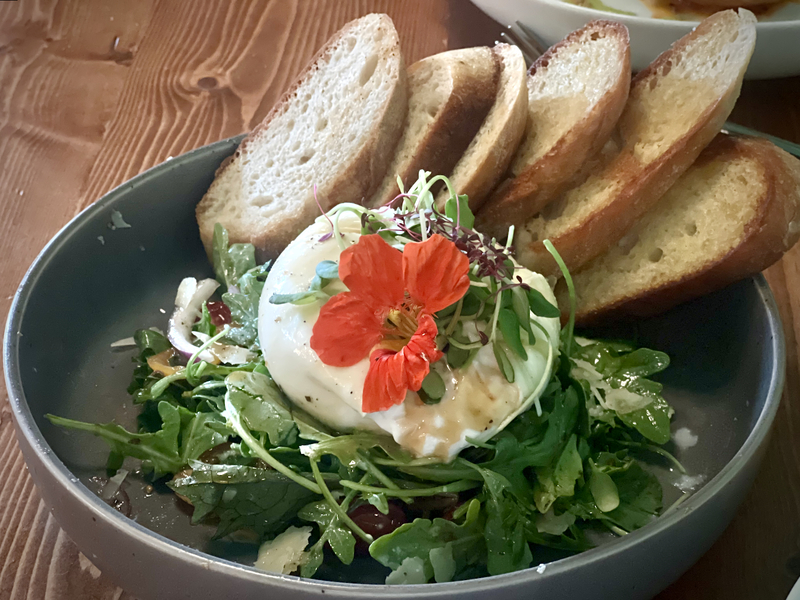
The redux includes a bolstered beverage experience, including over 70 beverages on tap, and a brand new menu from Culinary Director Thomas Hauck and Chef Nathan Owley featuring snacks, large format shareables and daily breakfast and brunch offerings (read more about those plans here).
But it also includes a new guest experience, due largely to an impressive interior revamp guided by a collaboration between Lowlands Group and longtime partners 360 Degrees and Rev Pop.
"It’s been 10 years since we opened Centraal," notes Lowlands’ director of brand and marketing Dan Herwig. "Meanwhile the neighborhood has grown up alongside us and we were in true need of an update. Originally, the restaurant was pulled together on a shoestring budget, so we developed a laundry list of things we really wanted to do."
Making Centraal more Grand
On the list was a reconfigured space to improve the guest experience, a long-needed interior refresh and a desire to bring the cafe in closer keeping to the Grand Cafe theme while bolstering its distinct identity, which – over the years – suffered from an identity crisis of sorts, failing to fully distinguish itself from Lowlands’ other Grand Cafés Hollander and Benelux.
In preparation for the revamp, the group scouted cities like Amsterdam, Antwerp, Ghent, Brussels, Bruges, Utrecht and Rotterdam for inspiration, bringing design professionals, including Brian Polster, Josh Oakes and Rob Binter of 360 Degrees along for the ride.
Polster says the 360 team really worked to identify ways to capture the character of the restaurant’s namesake, Centraal Station in Amsterdam. The goal was to maintain the historic character of Centraal’s building – which was once home to a pharmacy – while pulling in elements that really capture the vibe of a modern European city.
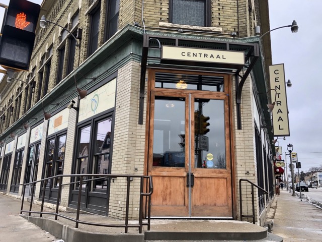
Some of the changes that grace the new Centraal are obvious. The main entry has been relocated to the door that overlooks the intersection of Lincoln and Kinnickinnic Avenues.
"Moving the main entrance to the corner was a big move," notes Herwig, "And it really served to open up the space."
Polster agrees, noting that – moving forward – the exterior will also be refreshed with a coat of navy blue paint and lighter complementary accents, potentially in brass or cream.
"It’s such a great corner to drive past, so one of the goals was to give it the presence that it deserved," he says. "Now, when you’re sitting inside, with the cars rushing past, you can almost feel the vibe of Centraal Station … and imagine the trains rushing past. And once the exterior is finished, you’ll really have more of that same feeling on the outside."
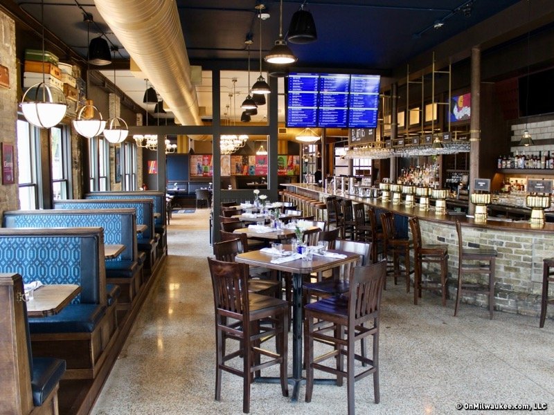
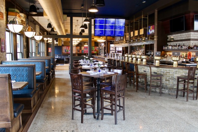
Despite its new open, airy feel – largely due to the removal of the huge vestibule that accompanied the side entrance – the cafe is now divided into two distinct parts: the Tappery and the Cafe. But even the divider – which consists of a freestanding partial half-wall – is minimal (more suggested than clunky).

The division is augmented with digital menus that take the form of "departure and arrival" boards, with colors and typography that conjure those used at Centraal Station.
The Tappery, which is the first section visible as guests pass through the front doors, has a convivial bar-like feel with large new booths.
.jpg)
Meanwhile, the cafe area is laid out a bit more like a restaurant, with low-top tables and just a few corner booths to maximize the seating area.
.jpg)
"You might have a couple enjoying a really intimate dinner in the back," says Polster, "And a big group drinking beer with huge boards of cheese in the front. And we wanted to create an atmosphere that really accommodated both."
Form & function
To do so, 360 Degrees employed a combination of tactics, many of which are tasteful, but subtle.
"Some of the biggest elements we changed were finishes, colors and textures," he says. "We didn’t want to lose the character of the space. So we went through and refinished the terrazzo flooring that remained here from the building’s days as a pharmacy and refurbished the wood flooring in the back cafe area."
A big switch was really taking advantage of the natural light in the restaurant, 86-ing the curtains that hung over the windows and complementing it with modern lighting that provides what Herwig calls, "soft pools of warm light."

In the Tappery, colorful repurposed luggage from area thrift stores hangs in racks above the booths. It's a visual element that screams "train station," but also brings the added benefit of assisting with sound absorption, keeping noise levels in check.
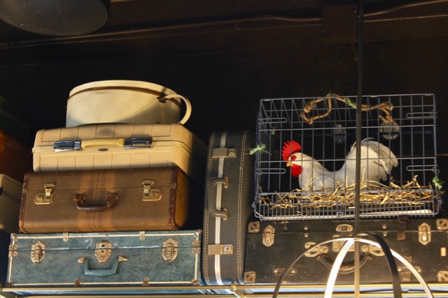
In terms of color scheme, guests will find pops of blue – under the bar in some areas, on the ceiling of the tappery and in the fabric adorning the spacious booths, which are not only constructed by 360 Degrees to be durable but to give the space a somewhat vehicular vibe, mimicking upholstery in cars and buses.

Meanwhile, mustard yellow was traded for brown accents around the cafe's windows, a change which serves to highlight the columns of Cream City brick, creating cohesion between the walls and the bar, which features a brick base.
Decorative elements include myriad posters – a collaboration between Lowlands, Rev Pop and 360 Degrees – offer a sense of place. They're designed with an upbeat, modern vibe and messaging that offers guests insights into both the cafe's personality and offerings.

"Graphically, they work as posters," says Herwig. "But they also speak to the items being used in the kitchen, really telling the story of the cafe in this really cool graphic way."
And astute observers will also pick up on the name "CENTRAAL" cleverly depicted in goemetric shapes on the back wall (And is that Matt Wild from Milwaukee Record? Why yes, yes it is. Hi, Matt!).
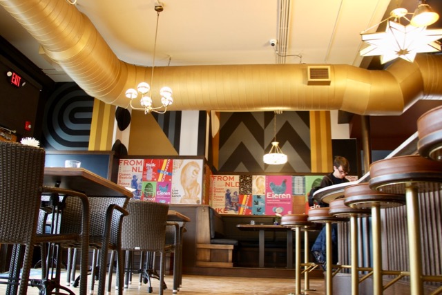
Moving forward the courtyard patio will also be renewed, notes Herwig.
"We’re investing in all new furniture to give the area an entirely new look," he says. "Ultimately, it will feel like a completely different, updated space."
In the meantime, guests can enjoy the shiny new interior (and menu), both of which now pay true tribute to a classic European Grand Café.
"Centraal was always meant to be unique," says Polster. "But it’s finally come into its own as a grand cafe … from the lighting to the textures and the tones to the curation of the taps. In the end, Cafe Centraal has grown up … we’ve helped to take it to the next level."
Stay tuned on Monday for more on the menu at Centraal Grand Cafe & Tappery, which will officially open its doors to the public on Wednesday, Feb. 13.
Lori is an avid cook whose accrual of condiments and spices is rivaled only by her cookbook collection. Her passion for the culinary industry was birthed while balancing A&W root beer mugs as a teenage carhop, fed by insatiable curiosity and fueled by the people whose stories entwine with each and every dish. She’s had the privilege of chronicling these tales via numerous media, including OnMilwaukee and in her book “Milwaukee Food.” Her work has garnered journalism awards from entities including the Milwaukee Press Club.
When she’s not eating, photographing food, writing or recording the FoodCrush podcast, you’ll find Lori seeking out adventures with her husband Paul, traveling, cooking, reading, learning, snuggling with her cats and looking for ways to make a difference.

