Editor's note: The following sponsored content was provided by Steinhafels.
Not every home redesign needs to be a complete overhaul. Sometimes it’s nice to freshen things up with some new furniture while keeping the pieces of the past that have sentimental value, or are just really cozy and you don’t want to give up!
Steinhafels can help with design projects ranging in size and scope, thanks to our in-house interior design service, Decorating Solutions. This week, we are looking at a recent Before and After project that incorporated new and old pieces.
Designer Emily Lindsley is based at our Kenosha store and shares her project with us. Here’s a guide to her process, in her own words:

When I first met the client, Lucy, she had talked about an open concept living room and kitchen area. Her goal was to update the space while tying in existing pieces. She wanted it to feel more unified. She really wanted that "Wow" factor when you walk into the room. Lucy’s home already has the beautiful open concept; it just needed some new paint, carpet, window treatments, furniture, and accessories to create a feeling of flow and unity throughout the space.
One piece that she wanted to keep was a La-Z-Boy brown reclining sofa that she had purchased recently. She also had recently redone her backsplash and countertops, so we had to work with those colors as well as the cabinet and floor colors. The backsplash consists of yellows, reds, and greens.
Before

Originally Lucy had red walls in the kitchen and yellow in the great room. This is a room with ample lighting. Even though there are large patio doors and some skylights, this attests to why paint color can be so important. I wanted a light, neutral color, but something with a slightly warmer tone to it. Choosing a warmer paint color brightened the room significantly. Even the brown La-Z-Boy sofa looks lighter.
After

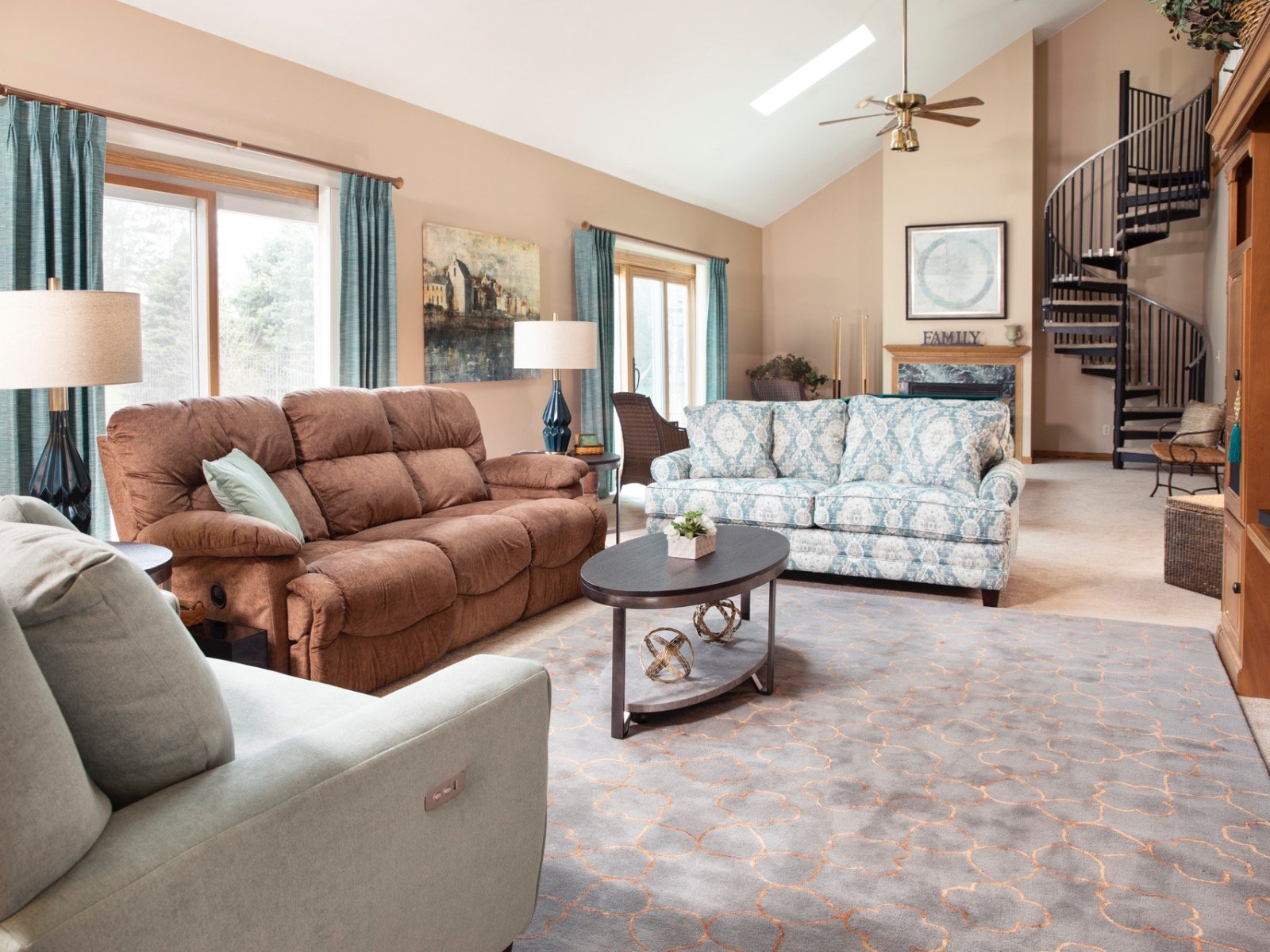
The color inspiration came from elements already in the room. The marble fireplace was sort of lost in the room when I first walked in. Even though the client did not want to change the arrangement of the room to focus on the fireplace more, I wanted to bring out the gorgeous green of the marble fireplace so that it did not get lost. Since there was also some green in the backsplash, and it was a nice change from the reds and yellows that my client was so tired of, I chose to go with greens and teals as the pop of color.
I choose the paint colors first. After I chose the paint color for the kitchen, it all kind of fell into place. The kitchen paint is a gray with a slight green tint and works in quite the opposite way as the paint in the great room; the kitchen already has many warm tones, so a cooler color was the perfect balance with the cabinets and the paint color in the great room.
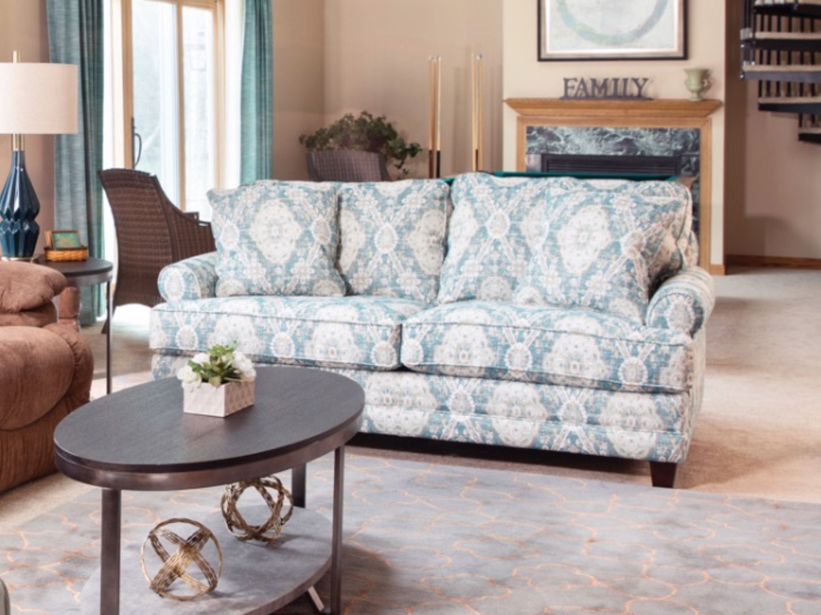
The patterned sofa creates a sort of bridge between the La-Z-Boy sofa and chair and a half. Since these were both a definite for the client, I had to find a way to incorporate them. She wanted comfort, so the brown sofa was important to her, but she also wanted a more updated and less puffy look in the other pieces. I directed my client to a customizable HGTV sofa because we could mimic the high legs, back cushion style, and arms of the chair and a half, therefore making this more of a set. Lucy fell in love with the teal patterned fabric.
Another challenge that we faced was a pool table. Since the family entertains often and uses the pool table frequently, Lucy wanted it to stay in this room. She did not want the pool table near her dining room so we tucked it behind a sofa, making it available for her entertaining needs but less of a focus in the room. A sofa was the obvious choice over two accent chairs because it created a way to downplay the pool table. The sofa fabric brings out the gorgeous green tone marble fireplace.

The client had purchased the La-Z-Boy sofa not long ago, so that was a piece that I had to work around. She also had a worn reclining chair and a half and knew that this was a piece that she would need to replace, but wanted another reclining chair and a half. The marble fireplace was completely lost in the room. Changing the paint colors brightened the space and brought the green marble back into view. The green painting over the fireplace also helps to bring this out.

I wanted to incorporate a darker color in pops throughout the space in order to tie the dining room to the great room.
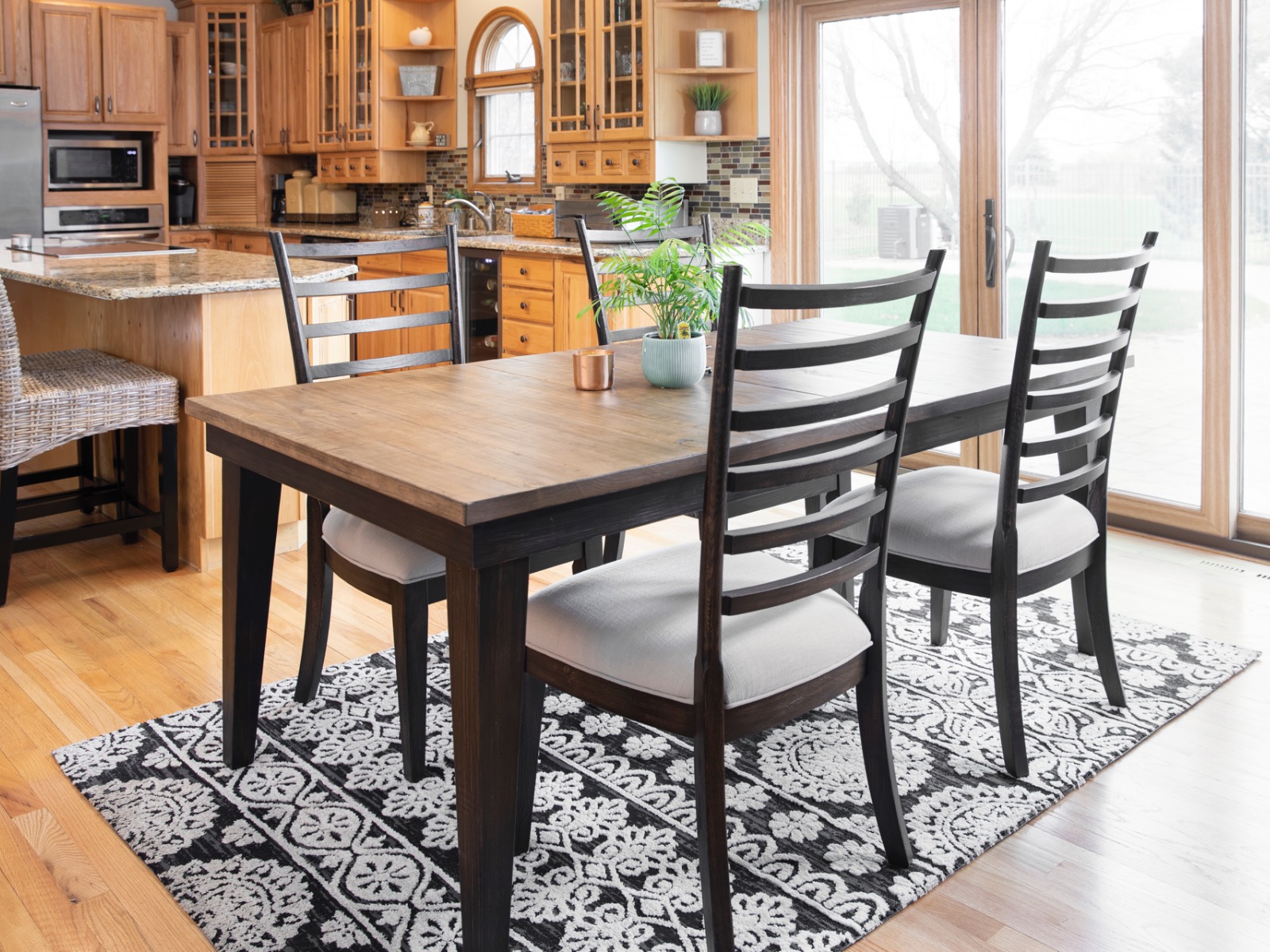
The great room has a spiral staircase going to an upstairs/loft area. This was the only piece in the space with any black or an industrial feel to it, and caught my eye as soon as I walked in. Against all of the oak, this piece sort of stood out as if it did not quite belong. The rest of the space had a very country feel to it with a rooster theme throughout. I hoped that the dark dining table set would tie in the dark of the staircase; I specifically chose a dining set where the rungs of the chair mimicked the shapes and the colors in the spiral staircase. This, along with the black and white rug, is also a nice contrast to all of the oak in the kitchen.

One thing that the client had specified that she wanted was a reclining chair and a half. Once I chose the paint color in the kitchen, I was sure that I wanted a slight gray/green for the chair and a half to tie that color into the great room as well.

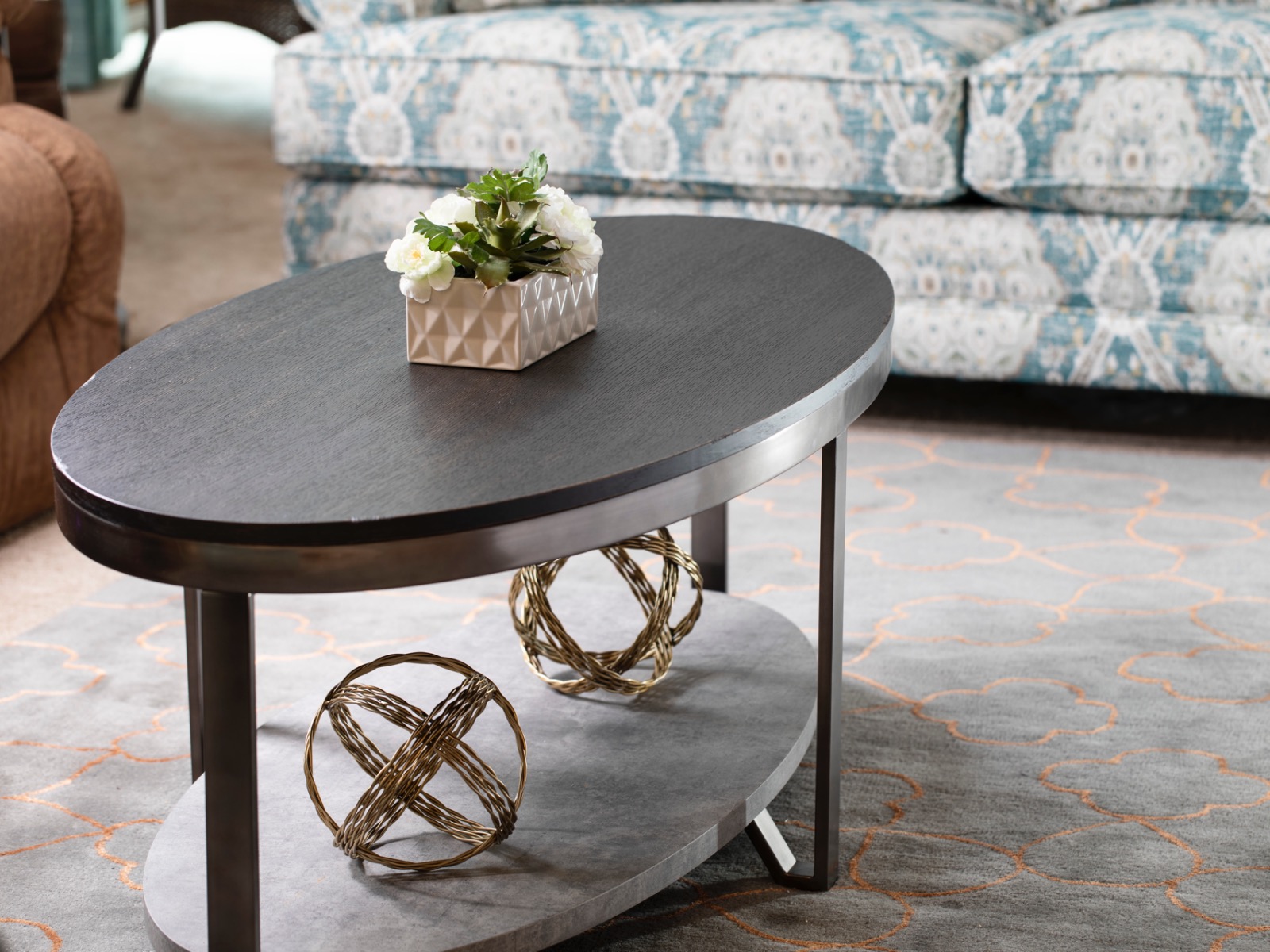
Avoiding an oversized coffee table was best because of the reclining furniture in the space. The copper in the rug pulls the warm tones from the woodwork in the kitchen and the brown La-Z-Boy sofa. The gray/green from the kitchen walls is carried through the rug. The metal from the spiral staircase is carried through the coffee table and end tables. The dark wood in the rungs of the staircase and the dining set is also in the table tops, therefore creating flow throughout the space.

The piece of artwork in this picture is the final piece that ties everything together!
The painting has teals that are carried throughout the design, but it also ties in some of the greens, yellows and reds from the kitchen backsplash. Most importantly, it stands out because it offers a variation from many of the smooth textures. Artwork is so important as a finishing touch. The texture of both pieces of artwork tie in nicely with the washed texture of the patterned sofa fabric.
The most rewarding part of the project was my client’s reaction at the end. As we met in the store and laid the fabrics out together, my client was so excited that she was jumping up and down and clapping her hands. She kept saying, "Emily, you have really outdone yourself!" The most important thing to me is capturing the client’s personality. I worked around pieces that she wanted to keep. I loved that she was open to a patterned piece for a pop of excitement versus choosing things that were "matchy."
This project is a great example of how every room has the potential to be transformed no matter the number of restrictions. We had a puffy brown La-Z-Boy sofa, a pool table, all of the colors and textures of the kitchen, and a metal spiral staircase to work with, and we were able to make them work together in a way that made my client ecstatic about her transformed space.
Lucy was pleased! Here’s a testimonial, in her own words:
"I am very happy that I went with a Steinhafels Decorating Solutions Interior Design package. Emily, my designer, helped me from start to finish – leaving me with a beautiful living room and kitchen. She was very patient and helpful, and her recommendations were spot-on to the modern look and feel I was trying to obtain. I feel like I have a brand new home because of her design!" Lucy from Pleasant Prairie, Wisconsin


